There are many types of data visualisation, but some common examples are bar charts, line charts and pie charts. These visualisations can show relationships between other data points, identify trends over time, or compare data sets.
- A bar chart could be used to compare revenues from different product lines.
- A pie chart could show the expenditure distribution across different categories or compare the market share of other companies.
- Line charts are a type of data visualisation that show changes over time. They are particularly suitable for financial data, such as sales figures, share prices or economic indicators.
Data visualisation can also detect anomalies and outliers, which can help detect fraud or errors.
Whether you need to present your data to a client, colleague or supervisor, data visualisation can help you communicate your findings clearly and concisely.
Benefits of data visualisation in accounting
The use of data visualisation in accounting offers many benefits, such as:
- Improve workflows by making it easier to find errors, spot trends and compare. It also saves time by automating repetitive tasks such as report generation.
- Data visualisation can also be used to create audit trails. This is because data visualisation can be used to track changes over time, which can reveal inconsistencies or irregularities.
- It also helps accountants better understand the data they work with. They can more easily understand complex data sets by identifying trends and patterns.
- Otherwise, data can be put into context, making it easier to see the connections with other data sets.
Besides all the practical benefits, data visualisation also has the potential to change the way people think about and communicate about data.
Improved data analysis
Data visualisation is not only used to make information easier to understand, and it also has the potential to improve the quality of data analysis. Data visualisation makes it easier to identify patterns and relationships.
When viewing tables, it would not be easy to see trends or compare different data sets without data visualisation. However, when a line chart of the data is created, any patterns and trends can be quickly identified.
Using data to optimise clients’ business performance, accountants can add value beyond compliance and improve client relationships.
Improved decision-making
Data visualisation helps accountants and entrepreneurs make more accurate decisions. It makes it possible to weigh up different options and compare trade-offs.
The decision will be made whether to invest in company A or company B. Without data visualisation, several financial indicators such as turnover, profit margins and debt levels would have to be compared manually – this is time-consuming and can be difficult. But if the financial data of the companies were visualised, one would quickly have an overview of everything and know which company is more attractive from an investment perspective.
Greater clarity and communication with clients and decision-makers
Example: A concept and the possible risks are to be explained to a client: Without data visualisation, it would probably take many words and technical terms to describe the risk, among other things. However, visually presented risks could be better recognised and understood by the client and how these risks could be mitigated. Furthermore, data visualisation can be used as a collaborative tool to improve communication between internal auditors and decision-makers. When explaining audit results or financial risk analysis findings, visual representations facilitate the understanding of the information.
Challenges of data visualisation in accounting
Despite the many advantages of data visualisation, accountants need help with this method. First, data visualisation requires a certain level of technical know-how. This is because to create an effective visualisation, one must know how to use the various software programmes and tools.
Another challenge is that data visualisation can be time-consuming, often involving collecting data from multiple sources, cleaning and organising it, and then creating the actual graph. This can be daunting, predominantly for busy accountants who already have to juggle many tasks.
While some challenges are associated with data visualisation, there are also ways to overcome them.
The presentation must be correct and understandable
One of the most critical things accountants need to do when using data visualisation is to ensure that their visualisations are accurate and precise. This can be a challenge when working with large and complex data sets. However, there are some steps that accountants can take to ensure that their visualisations are as accurate as possible:
- Only use data from reliable sources: When collecting data for their visual representations, accounting staff should use data from reliable sources to ensure that the information is accurate and up-to-date.
- Check accuracy: Once the data has been collected, accountants should check the accuracy of the calculations and compare data from different sources.
- Use clear captions and subtitles: When creating the actual visuals, accountants should use clear captions and subtitles to explain what the data shows.
- Use simple designs: Data visualisations should be designed to be user-friendly. This means that a simple design should be used, and clutter should be avoided.
- Accurate and clear presentation is crucial for accountants who want to use this tool effectively.
Avoiding bias in the visualisation of data
Biased results in data visualisation can come from different sources, e.g. our opinion, the way the data was collected and the way the visualisation was designed. The most common types of error sources that can creep into data visualisation include:
Selection Error: This is when only specific data are included in the visualisations, while other data that could be equally important are not considered.
Design errors: e.g., using colours or shapes that convey a specific message.
Interpretation error: This is when you interpret the data in a biased way, e.g. by coming to conclusions not supported by the data.
However, there are some measures users can take to avoid bias in their representations:
- Be aware of your bias.
- Consider different points of view.
- Get feedback from others.
Work with large and complex data sets
Accountants often work with large and complex data sets. While this data can provide valuable insights, it can also be challenging.
One of the biggest problems when working with large data sets is choosing the “right” visual representations. With such a large amount of data, it cannot be easy to know which visuals best represent the information. The wrong visual can make the data look disorganised and confusing, while the right visual can help convey the meaning of the data.
Another challenge when working with large data sets is that they are time-consuming and difficult to manage. For this reason, accountants should use an all-in-one platform to make their work easier. An all-in-one platform saves time by allowing accountants to access all their data in one place. It can also help simplify data management by providing tools for organising and analysing data.
Creating effective data visualisations
It can be challenging to create a compelling visualisation. Several factors must be considered, such as the type of data, the goal of the presentation and the target audience.
When creating data visualisations, accountants should consider the following tips:
Audience analysis: Who will see the visualisation? What is their level of expertise? What do they want to learn? Answering these questions will help to create a graphic tailored to the audience.
Determine goals: What do you want to achieve with your visualisation? Do you want to convey a data-driven message? Do you want to explain a complex topic? If you know your goals, you can choose the right type of visualisation.
Preparing the correct data: Some data is different. When preparing data for visualisation, care should be taken to ensure that current and relevant data has been selected.
Pick the correct type of visualisation: As already mentioned, there are different types of data visualisation.
Using software: Many software programmes can help with data visualisation. The most popular options include Microsoft Excel and Google Sheets.
Creating an effective graphical model can be challenging. Using the tool can be very useful in certain situations, such as providing information for an internal or external audit, as it is an easy way to track changes in data over time. Data visualisation helps accountants to listen carefully.
Source: accountingweb.co.uk
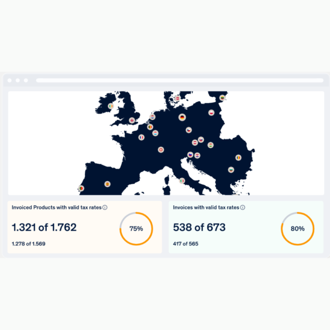
SPOT® Permanent transaction control – the e-commerce dashboard
SPOT® is an omnichannel merchant transaction dashboard providing financial control on e-commerce sales with a strong focus on real-time alerts on cross-border tax, customs, and compliance issues.